
Series: Building AwesomeWildStuff.com From Scratch | Post #2: Building the Design System — Elementor Global Colors and Fonts
Difficulty: Beginner–Intermediate | Time: 45–60 minutes
Welcome Back to the Build!
In Post #1 — deploying WordPress on Azure App Service — we went from an empty Azure subscription to a live, secured WordPress site. It worked. It was also, let’s be honest, extremely ugly — a default theme with default fonts and default everything.
Today we fix that. Not by designing a homepage yet, but by doing the thing most people skip: building the design system first. Before a single section gets laid out, we’re going to teach Elementor our colors, our fonts, and our defaults, so that every page we build afterward inherits them automatically.
This is the least glamorous post in the series and probably the most important one. Skip it and you’ll spend the next six months hand-picking the same orange out of a color wheel over and over, and getting it slightly wrong every time.
💡 A note on Editor V4: AwesomeWildStuff is built on Elementor’s Editor V4, currently in beta. The panels look different from the classic editor, and the widgets are the new atomic ones (e-heading, e-paragraph, e-button). If you’re on V3, everything in this post still applies — the menu names are nearly identical, and Global Colors and Global Fonts work the same way in both.
Part 1: Why the Design System Comes First
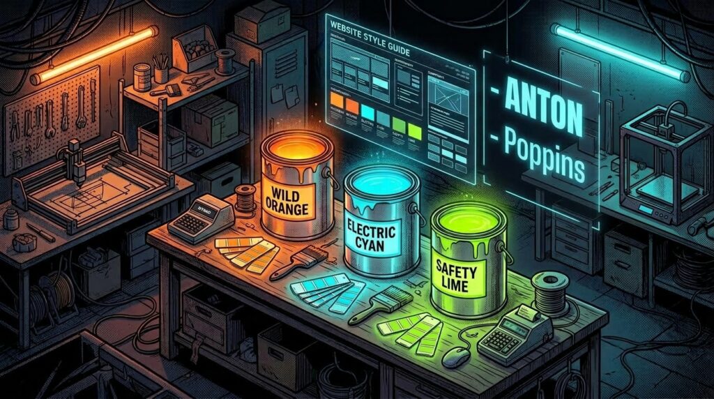
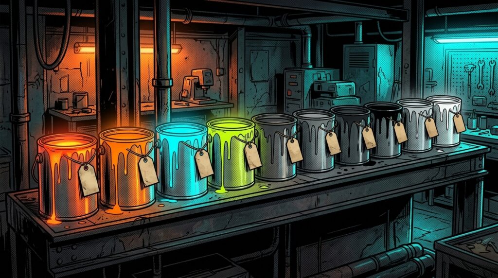
Elementor has a feature called Site Settings. Inside it are Global Colors and Global Fonts. Think of them as the paint cans and the label maker in your shop: you mix the paint once, you name it, and from then on you grab it by name instead of re-mixing it every time.
The practical payoff comes six months from now. When you decide your orange is slightly too red, you change it in one place and every button, heading, and border on every page updates all at once. If you hand-picked hex codes into 200 individual widgets, you’re doing 200 individual edits.
Part 2: Opening Site Settings
Step 1: From your WordPress Dashboard, go to Pages, open any page, and click Edit with Elementor. (Any page works — Site Settings is global, not per-page.)
Step 2: In the Elementor editor, click the hamburger menu in the top-left corner of the panel.
Step 3: Choose Site Settings. This opens the global configuration for your entire site.
Step 4: You’ll see sections for Global Colors, Global Fonts, Typography, Layout, and Site Identity. We’re going to work through them in that order.
Part 3: Building the Color Palette
Here’s the actual palette running AwesomeWildStuff.com right now. Ten colors, every one of them named:
| Name | Hex | What It Does |
|---|---|---|
| Wild Orange | #FF6A00 | The primary brand color. Buttons, headings, key accents. |
| Hot Orange | #FF8A00 | A lighter orange for hovers and gradients. |
| Electric Cyan | #00D9FF | The secondary accent. Links, subheads, highlights. |
| Safety Lime | #A8FF00 | A loud spot color, used sparingly for emphasis. |
| Deep Black | #050505 | The darkest background tone. |
| Charcoal | #151515 | The main page background. |
| Graphite | #242424 | Card and panel backgrounds, one step up from the page. |
| Black | #000000 | True black, for maximum contrast moments. |
| Light Gray | #D7D7D7 | Body text on dark backgrounds. |
| White | #FFFFFF | Headings and high-contrast text. |
How to Add Them
Step 1: In Site Settings, click Global Colors.
Step 2: You’ll see four system colors at the top (more on those in a moment) and a Custom Colors section below.
Step 3: Click the + next to Custom Colors to add one.
Step 4: Click the color swatch and enter your hex code.
Step 5: Click the name field and give it a real name. This matters more than it sounds like it does.
Step 6: Repeat for every color in your palette, then click Save Changes.
💡 Name colors by what they are, not where they go: “Wild Orange” ages well. “Button Color” does not — the day you use it for something that isn’t a button, the name is a lie. Descriptive names survive redesigns; positional names don’t.
A Word on Building a Dark Palette
Notice that four of our ten colors are near-black: Deep Black, Charcoal, Graphite, and Black. That is not indecision. On a dark site, you need several dark tones to create depth — the page sits at Charcoal, cards sit at Graphite, and the contrast between them is what makes a layout feel layered instead of flat.
The same logic applies to text. Pure white body copy on a black background is harsh to read at length, which is why body text is Light Gray and only headings get White.
Part 4: The System Colors Trap
This one cost me real time, so let me save you some.

Above your custom colors, Elementor keeps four system colors: Primary, Secondary, Text, and Accent. Out of the box they are set to Elementor’s stock values — a sky blue, two greys, and a green. Nothing to do with your brand.
Here’s the trap: adding ten beautiful custom colors does not change those four. And a lot of Elementor widgets fall back to “Primary” or “Text” when you haven’t explicitly styled them. So you build a gorgeous orange-and-cyan site, drop in a fresh widget six months later, and it shows up in a sky blue you never chose.
Map them to your palette:
| System Slot | Elementor Default | Set It To |
|---|---|---|
| Primary | #6EC1E4 sky blue | Wild Orange #FF6A00 |
| Secondary | #54595F grey | Electric Cyan #00D9FF |
| Text | #7A7A7A grey | Light Gray #D7D7D7 |
| Accent | #61CE70 green | Hot Orange #FF8A00 |
Step 1: In Global Colors, click the swatch beside Primary.
Step 2: Enter your brand’s primary hex code.
Step 3: Repeat for Secondary, Text, and Accent.
Step 4: Save. Nothing on your existing pages should visibly change — if you styled everything explicitly, nothing was using these anyway. That’s the point: you’re fixing what happens next, not what happened already.
Part 5: Global Fonts
Two typefaces run this entire site:

| Slot | Font | Weight | Used For |
|---|---|---|---|
| Primary | Anton | 600 | All headings. A tall, condensed display face that shouts. |
| Secondary | Poppins | 800 | Subheads and emphasis that need weight without shouting. |
| Text | Poppins | 400 | Body copy. Clean, round, readable at length. |
| Accent | Poppins | 800 | Buttons, labels, small bold UI text. |
That’s the whole system: one display font, one workhorse font. It’s a classic pairing strategy and it’s hard to get wrong. Anton has personality and zero patience for long paragraphs. Poppins has no strong opinions, which is exactly what body text needs.
How to Set Them
Step 1: In Site Settings, click Global Fonts.
Step 2: Click the pencil icon next to Primary.
Step 3: Set the Font Family (Anton for us) and the Weight (600).
Step 4: Repeat for Secondary, Text, and Accent.
Step 5: Save Changes.
⚠ Every font you add costs load time: Elementor pulls these from Google Fonts, and each family and weight is another file the browser downloads. Two families is a design system. Six is a performance problem. Pick your two and commit.
Part 6: Making Your Content Inherit It
Defining global colors and fonts does not automatically apply them to everything. Site Settings has a separate Typography section that sets the defaults for body text and headings — and until you fill it in, anything that isn’t a hand-styled Elementor widget falls back to your theme.
This is exactly why my first blog post needed custom CSS to look right: the article content is WordPress blocks, not Elementor widgets, so it inherited nothing.
Step 1: In Site Settings, open Typography.
Step 2: Under Body, set the typography to your Text global and the color to your body-text global (Poppins 400 / Light Gray here).
Step 3: Work down through H1 to H6, setting each to your heading font and color (Anton / White here).
Step 4: Save Changes.
⚠ Do not set a global link color without testing it: I set mine to Wild Orange and immediately made a button disappear. The button was a link with no explicit text color, sitting on an orange background — so it inherited orange text on orange. Invisible. If you set a global link color, click through every button on your site afterward.
Part 7: Site Identity
Last stop. Still in Site Settings, click Site Identity:
- Site Name: AWESOMEWILDSTUFF
- Site Description: Imagine it. Design it. Build it. Make it awesome.
- Site Logo: Upload your logo here so widgets can pull it dynamically instead of you re-uploading it into every template.
- Site Favicon: The little icon in the browser tab. Square, at least 512×512.
Setting the logo here rather than dropping an image into your header template means that when the logo changes, it changes everywhere at once. Same principle as the colors.
What We Built Today
No new pages. Nothing that looks different in a screenshot. And yet:
- A ten-color palette, every color named and reusable by name
- Four system colors mapped to the brand, so nothing falls back to Elementor’s stock blue
- A two-font system — Anton for display, Poppins for everything else
- Global typography defaults so content inherits the system instead of guessing
- Site identity set once, in one place

The next post is the fun one, and it’s only going to be fun because of the work we did today.
Coming Up in Post #3
We build the homepage. Hero section, the capabilities grid, the shop preview, and the calls to action — using every color and font we just defined, without picking a single hex code by hand.
Questions? Hit us up at le***********@**************ff.com.
Stay awesome. Stay wild. Keep making stuff.
— John O’Neill Sr.
Founder, AwesomeWildStuff | AWS Solutions LLC